
After reading this blog’s title you may be wondering what a highly converting website is. In simple terms, it’s the process that starts when a visitor lands on your website and ends when they purchase a product or service, sign-up for your e-mailing list, complete their registration etc. Typically the ultimate goal of a business owner’s website is to convert visitors into customers. There are a lot of factors that influence your conversion rate and it’s hard to tell if there’s one element in particular that impacts your conversion rate the most, but the good news is that there are some factors that will help improve your conversions.
#1 Clear Headlines and Messaging
Never underestimate the power of a good headline. Your headline should grab your visitor’s attention and let them know what page or section is about. This is especially important on your website’s homepage because it’s typically the first thing visitors see. So I always recommend the main headline–usually part of your banner/header image at the very top of your homepage–showcases who you are, what you do, and who you serve. Something catchy and creative, yet clear is always a win.
Your messaging throughout your website should fall in line with your overall brand voice outlined within your brand strategy. You should feel confident that your brand shows up the same everywhere (website, social media, etc); it should also correspond with the rest of the brand identity (the visuals, emotions the brand evokes).
#2 User Friendly/Responsive layout
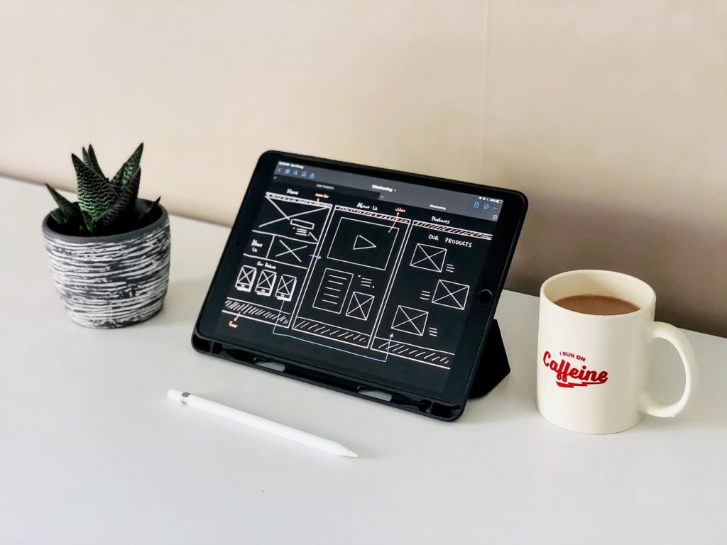
Since your website is considered your digital homebase it’s important that it looks the par. Highly converting websites generally have a nice design that is sleek and functional. It would be useful to invest in a designer to help elevate your website (a lil plug!) as they’ll consider organization, flow, flexibility and more.
However, if you’re doing it on your own it’s helpful to think about what elements are necessary so your website can be more streamlined. You should also consider how people scroll, the number of pages in your navigation bar, and where you’re placing content (images, text, etc). The most important pages should be the easiest to find. This will generate leads for your business.
Lastly, it’s important to remember that your website should be responsive, so that it can be accessed from all devices. A responsive website should have an adaptable design that allows viewers to have a good experience no matter how they’re viewing it. Aim for your website to look just as good on mobile/tablet as it does on the desktop since a majority of users are on the go.
#3 High Resolution Imagery
We hate blurry images, right? So why would you put that on your website? Your images should be in the clearest format. I recommend 300dpi, which is the highest resolution that gives maximum clarity. Stay away from cellphone or low resolution images as they tend to get stretched, distorted, and even pixelated.
Brand photography is ideal because it’s tailored to your brand, but if it’s not in the budget consider some royalty free websites such as freepik, unsplash, or pexels. There are also paid services such as shutterstock, haute stock, or social squares which gives you the ability to pay based on your needs. Whatever you decide to choose just remember to select images that go with your overall brand vibe, aesthetic, and colors.
PRO-TIP: One thing that I’ve noticed over the years is that photographers often host “mini brand sessions” that allow them to take pictures of multiple clients in a day. They also refer to these as headshot marathons because sessions are pretty limited to ~20minutes, yet you’ll walk away with a good 5 headshots to use.
#4 Call to Action Buttons
You should have a call to action button on every page. A call-to-action is a button or linked sentence on your website that tells your reader what to do next. Buttons like “learn more” / “contact us” help out a lot with this. Every page should ideally have this so they don’t have to do much work to get to the next step. It’s important to guide your visitors through the buying journey using strategic calls-to-action. Visitors shouldn’t have to search or go back to find out the next possible steps or ways to get into contact with you. These buttons should be clearly visible so it’s harder for visitors to miss.
#5 Lead Magnet/Freebie
To capture user info create a valuable downloadable such as a workbook or a checklist etc. to entice the visitor to provide their email. This way you can continue to market to them through some kind of email marketing campaign. It’s best to integrate a tool/software into the site (i.e. Mailchimp, FloDesk, etc) to carry this out because it’s streamlined and easy to use and design.
TRY IT OUT: I’m currently loving FloDesk because of the beautiful premade designs. Utilize my affiliate link by clicking here to save 50%.
Email marketing is a good way to share promotions, new products/services, gather feedback, and even stay top of their mind. It’s always worth building your email list and sending out an email newsletter. Remember, these people will become warm leads if you continue to nurture them.
Having a highly converting website is a long journey because there are so many changes that could be made. Making tweaks every now and then are good to let you know what’s working and what isn’t. In due time you’ll be seeing visitors becoming customers. Trust the process!


